Happy Clients
Projects Done
Hours Worked
Support Available

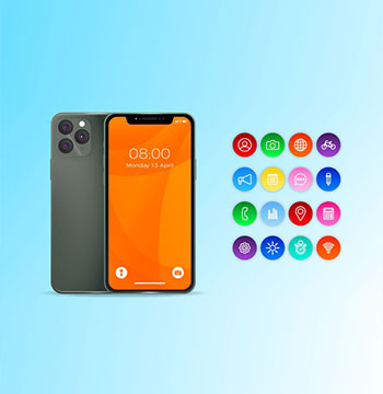
In today’s multi-device world, a responsive website is not just a luxury—it’s a necessity. Responsive web design ensures your website automatically adjusts its layout, content, and functionality to provide the best possible viewing experience across all devices.
At xLab IT Consulting, we specialize in designing mobile-first, responsive websites that enhance user engagement, reduce bounce rates, and improve SEO performance. Whether you're building a new site or revamping an old one, we ensure it performs smoothly and looks stunning everywhere.
We offer a complete range of responsive design services that elevate usability and ensure your brand looks great on any device.
We begin our design process with mobile in mind to ensure optimal functionality and performance on smaller screens.
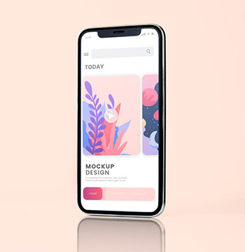
Your website will look consistent and work seamlessly across smartphones, tablets, laptops, and desktops.
Already have a website? We’ll upgrade it with a responsive layout to meet modern user expectations and search engine standards.
We implement CSS flexbox and grid systems to create fluid layouts that adapt to varying screen sizes.
We deliver responsive images and videos to ensure faster loading times and an optimal viewing experience.
All interactive elements are designed to be easily accessible and user-friendly on touch screens.
We rigorously test your website on real devices and emulators to guarantee smooth performance across all platforms.
Hire a Dedicated Developer
Hire NowOur process is structured to ensure your website is not only responsive but also user-centered and high-performing.
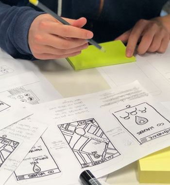
We understand your business goals, audience behavior, and technical needs.
We start with mobile layouts and progressively enhance them for larger screens.
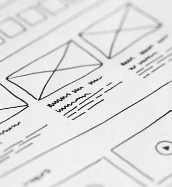

Designs are created with scalable fonts, flexible containers, and adaptive components.
Our developers bring designs to life using modern HTML5, CSS3, and responsive frameworks like Bootstrap or Tailwind.

Every design is tested on multiple devices and browsers to ensure compatibility.
We optimize for performance, accessibility, and SEO before deploying your responsive website live.
Let’s turn your ideas into applications device friendly.
We prioritize mobile usability from the start, ensuring a consistent experience across devices.
Our responsive designs are built to load fast and rank higher in search engine results.
We use the latest frameworks and design systems to ensure your website is modern and scalable.
Every design decision is made with the end-user in mind, improving satisfaction and conversion.
We test rigorously on real devices—not just simulators—for flawless results.
Let's Start a New Project Together
Inquire NowWe think big and have hands in all leading technology platforms to provide you wide array of services.
ios, design
Graphic, Print

Web application
Android & iOs, Design

UI/UX Design
Graphic, Print
Or call us now +91 98287 00333


